Property Branding in Namibia: DoneDeal Properties Case Study
Property branding in Namibia matters because real estate is built on trust. Before someone lists a home, buys a property, rents a flat or downloads a property app, they need to feel that the brand behind the platform is credible, clear and easy to use.
DoneDeal Properties approached Adzooka with a brand that already had recognition, but needed a sharper, more modern identity. The business was moving into a more digital future, with a mobile app experience becoming a key part of how users would search, filter and interact with property listings. The old identity needed to evolve into something cleaner, stronger and more suitable for both brand communication and mobile interface design.
Adzooka redesigned the DoneDeal Properties logo, refreshed the full brand look and feel, and developed the visual direction for the mobile app. The goal was not only to make the brand look newer. The goal was to make DoneDeal Properties feel more trusted, more usable and more ready for Namibia’s fast-moving property market.
Why the Brand Needed to Change
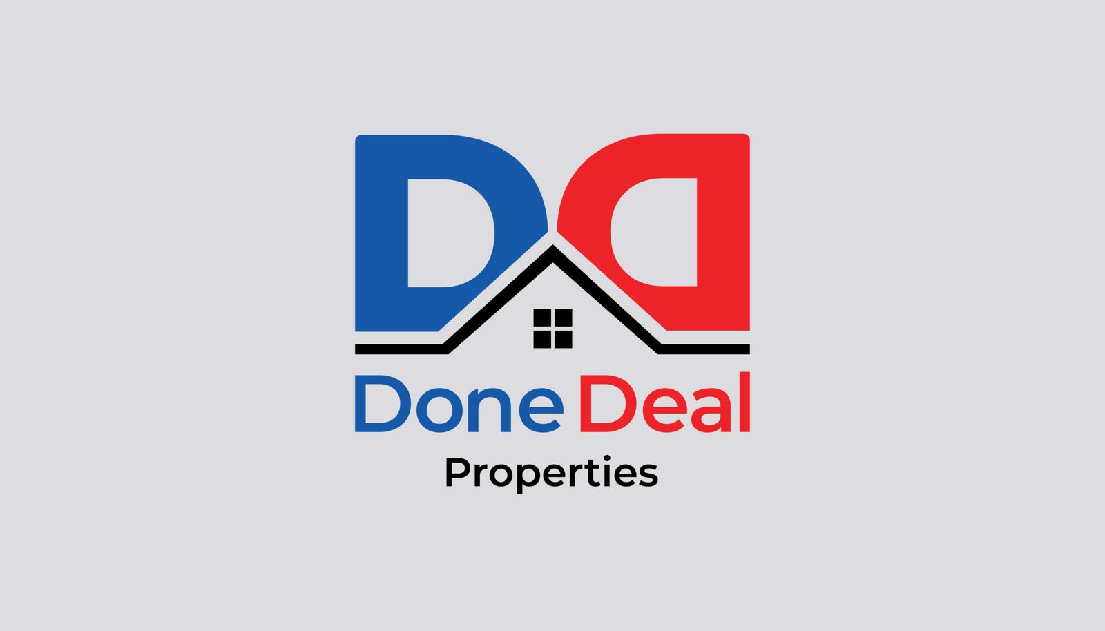
The original DoneDeal Properties logo had a clear property reference, using a house shape and the initials of the brand. It was simple and recognisable, but it felt more like a traditional real estate logo than a modern property platform. As the business prepared for a stronger digital presence, the identity needed more flexibility.
A property brand today has to work across many touchpoints. It must look good on a website, in social media posts, on property boards, in app stores, inside a mobile app, on digital adverts and in client-facing communication. Property branding in Namibia must now think beyond a logo on a signboard. It must support how people actually search, compare and make decisions.
Namibia’s property market is also becoming more competitive and more complex. Recent reporting shows pressure around housing supply, property prices and affordability, which makes digital property search tools more important for buyers, renters and agents. In this environment, a property brand must feel useful before it tries to feel clever.
The Logo Redesign
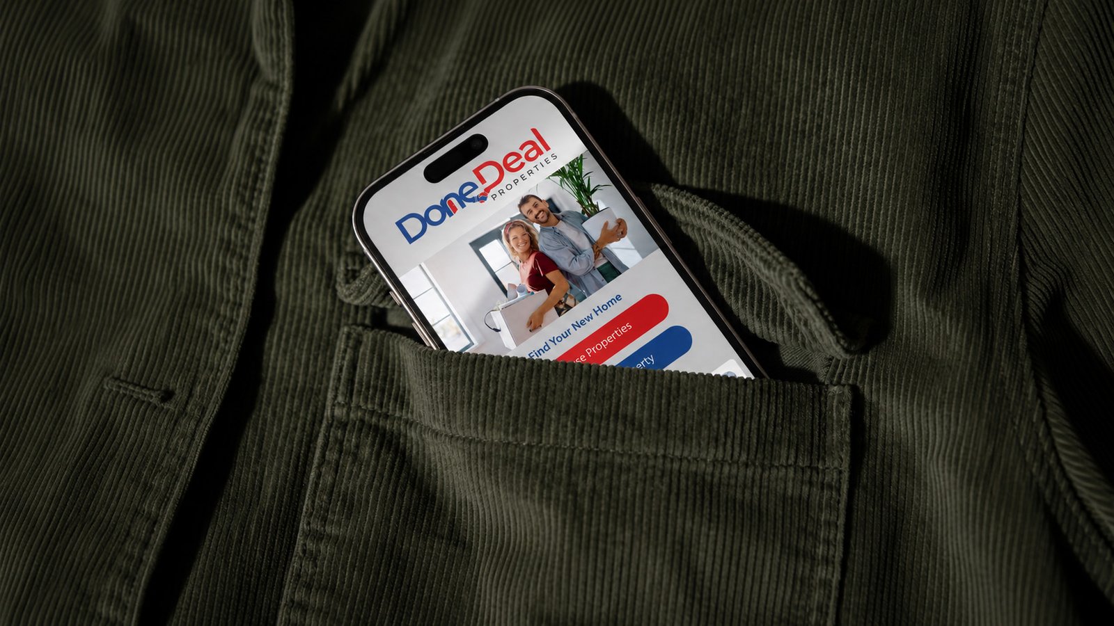
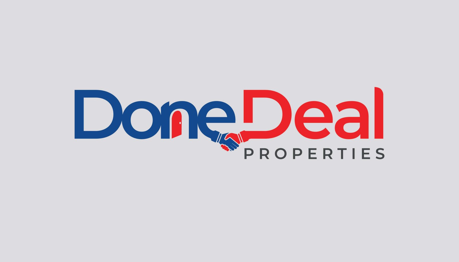
The new DoneDeal Properties logo keeps the familiar blue and red brand colours, but gives the identity a cleaner and more confident structure. The updated wordmark is easier to read, more compact and better suited to digital use. It removes unnecessary complexity while keeping enough personality to feel ownable.
The handshake detail inside the wordmark introduces the idea of agreement, trust and successful property transactions. This is important because the name DoneDeal already suggests completion, confidence and a deal that has been successfully concluded. The logo now supports that meaning more directly.
This property branding in Namibia project was not about throwing away the old identity completely. It was about evolving it. The new logo keeps the spirit of DoneDeal Properties, but makes it more professional, more scalable and more appropriate for a mobile-first property platform.
A Complete Brand Refresh
Beyond the logo, Adzooka developed a refreshed visual language for DoneDeal Properties. The brand direction uses strong red and blue as primary recognition colours, supported by clean grey backgrounds, rounded interface elements and bold calls to action. This creates a balance between energy and trust.
Red gives the brand urgency and action. Blue brings confidence, structure and reliability. Together, they create a strong property platform identity that feels active without becoming aggressive.
The refreshed brand system was designed to work across both marketing and product environments. That matters because many brands look good in a logo presentation but fall apart inside real user interfaces. For DoneDeal Properties, the brand had to work inside buttons, filters, tabs, icons, forms and navigation.
Mobile App Look and Feel
Adzooka also designed the look and feel for the DoneDeal Properties mobile app. This included the visual direction for search screens, property filters, price range selection, property type buttons, rent and buy toggles, navigation icons and key user interface elements.
The app interface needed to feel simple and direct. Property search can become frustrating when users are forced through too many steps or unclear filters. The DoneDeal Properties app look and feel uses familiar controls, clear labels and strong visual hierarchy so users can move through the search process with confidence.
The mobile app design supports searches by property type, dwelling type, bedrooms, bathrooms, kitchens, erf size, square metres, price range and whether a property is new or existing. These details matter because people searching for property are not browsing casually. They usually have a specific budget, location, property type and lifestyle need in mind.
This is where property branding in Namibia becomes more than a visual exercise. A strong property brand must also support the user journey. It must help people search faster, compare more easily and feel that the platform understands what they are looking for.
Designing for Trust in Real Estate
Real estate is one of the highest-value decisions most people will ever make. A property platform therefore needs to communicate credibility at every touchpoint. A weak interface can make users feel uncertain. A confusing brand can make a business look less established than it really is.
The DoneDeal Properties refresh focused on making the brand feel more stable, more digital and more transaction-ready. The logo now feels sharper. The app interface feels more deliberate. The colour system is more consistent. The overall visual identity is easier to apply across digital channels.
This kind of property branding in Namibia helps a real estate business move from being seen as only an agency or listing service to being seen as a serious property platform.
Why This Matters for Property Businesses
The property sector is changing. Buyers and renters expect digital convenience. Agents need stronger platforms. Developers need clearer presentation. Property companies need brands that can build confidence before a client makes contact.
According to the Bank of Namibia, housing and affordability remain major national concerns, which makes clear access to property information an important part of the wider property ecosystem. A better digital property experience does not solve the housing market, but it can make search, comparison and enquiry easier for users.
For DoneDeal Properties, the refreshed brand and mobile app look and feel create a stronger base for future growth. The brand is now better prepared for app launch, digital campaigns, online property search and broader market visibility.
The Result
Adzooka delivered a complete brand refresh for DoneDeal Properties, including a redesigned logo, a stronger visual identity and a mobile app look and feel built around usability and trust.
The result is a cleaner, more modern and more digital-ready property brand. DoneDeal Properties now has an identity that can work across traditional real estate communication and mobile-first property search.
This project shows how property branding in Namibia should be approached. It is not only about changing a logo. It is about building a brand system that can support credibility, technology, user experience and long-term business growth.
For property companies, real estate platforms and app-based businesses, Adzooka creates brand identities that are built to work in the real world. From logo redesign and brand refreshes to mobile app look and feel design, we help Namibian businesses present themselves with more clarity, confidence and commercial strength.